Writer’s Digest Subscribers vs. Newsstand Buyers
Everyone has offered such wonderful comments on the magazine covers that I wanted to share/review some of them: Mary Ulrich comments: I would think you have two audiences, the subscribers…
Everyone has offered such wonderful comments on the magazine covers that I wanted to share/review some of them:
Mary Ulrich comments:
I would think you have two audiences, the subscribers and the people who will buy WD off the shelves. The first sample has more of the "Entertainment tonight" appeal and might hook the McGafferty fans to an impulse purchase. As a subscriber I like number 2 or 3 because I am most interested in the "craft" articles and like a creative drawing. …
In the Dec. issue of WD, in the small print on the bottom of page 2, it says that WD is "a bimonthly publication". Last issue I was confused to receive the December issue at the beginning of October. So WD is published bimonthly, 6 X a year, or quarterly?
First, to answer Mary's question: WD magazine is published 6x/year. I'm
not sure why, up until this point, we haven't clarified this by labeling the cover with
"November/December", "January/February" and so on. Something for me to
research!
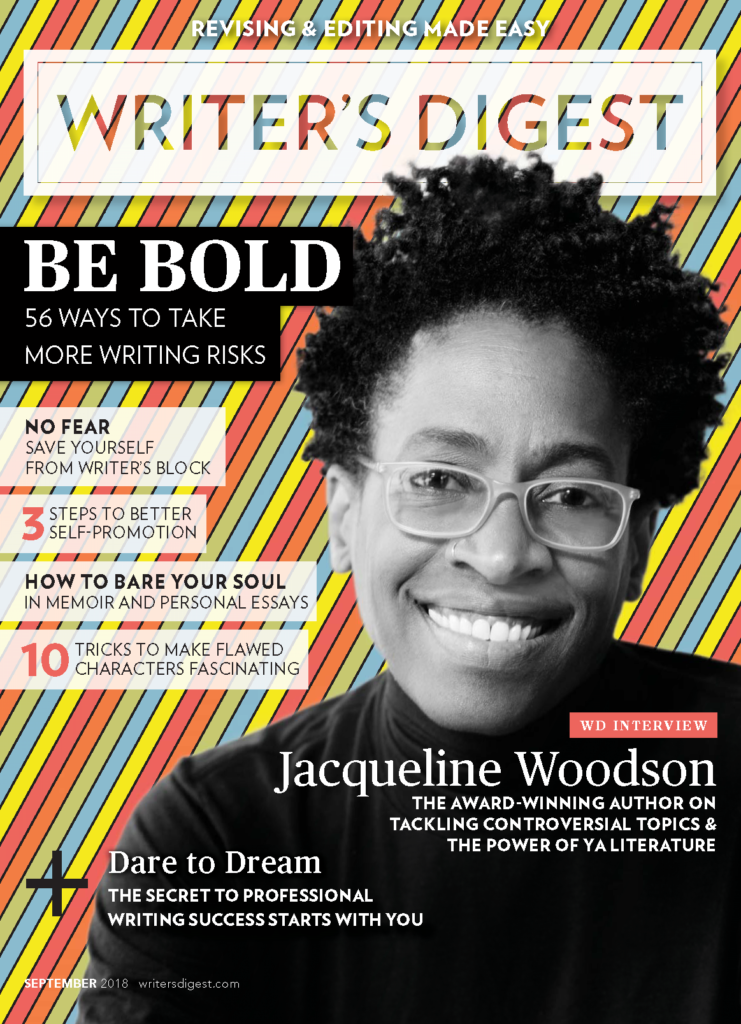
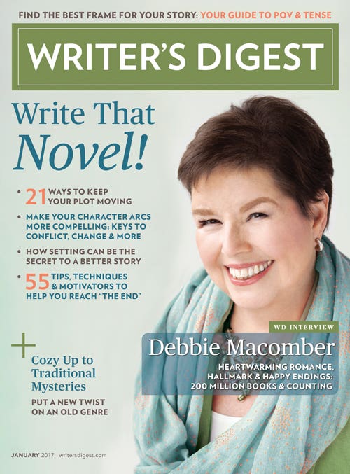
But to get to the real point: Mary hits on a perplexing issue that Writer's Digest magazine faces: the difference between what would be appealing to many of our subscribers (usually more advanced writers) and people who buy the magazine off newsstand—the type of person we usually label as the "aspiring writer" or the "dreamer," though all great writers are dreamers (even still aspiring) to some extent.
WD's circulation department has sales information that supports using an author photo on the cover because photos perform better than illustrations on the newsstand. Of course, what subscribers would prefer is a gray area, but based on the small sampling of comments here, it does appear that people who have read the magazine for a while tend to favor the illustrated cover.
However, it's hard to overlook the truth behind these comments:
A writer on the cover makes me connect as opposed to some abstract art. (PatriciaW)
The picture on the front cover of real people who struggled to write
and enjoyed every bit of their struggle, touches my heart most and
gives me the motivation I need as an aspiring writer. Their success to
be featured on the cover speaks more words than any art could reflect.
Art and cartoon could work for specific topics inside the magazine, but
real people appeal more to the majority of would be writers.
(Amina)
The first one absolutely caught me. I didn't know who Megan McCafferty
was, but it didn't matter to me, as the "Write Your Novel in 2009" was
much the clearest on that page, and that was what grabbed me. (Deb)
I generally tend to believe that writers who buy off newsstand are initially pulled in by the photo (they connect with the human face -- this is probably subconscious -- even if they don't recognize the face), but don't buy the issue unless the cover lines really deliver on a benefit or dream the writer has -- in this case, to write a novel.
As for subscribers, I can only hope they continue to renew because of great content, and generally overlook covers meant to appeal to newsstand buyers?
It's a big challenge for us to tackle in 2009 and beyond.
Jane Friedman is a full-time entrepreneur (since 2014) and has 20 years of experience in the publishing industry. She is the co-founder of The Hot Sheet, the essential publishing industry newsletter for authors, and is the former publisher of Writer’s Digest. In addition to being a columnist with Publishers Weekly and a professor with The Great Courses, Jane maintains an award-winning blog for writers at JaneFriedman.com. Jane’s newest book is The Business of Being a Writer (University of Chicago Press, 2018).